In the Netherlands, most people find it difficult to be efficient in keeping up healthy eating habits and shopping for groceries. They crave a balance between their busy lives and their dietary preferences.
Project: Rosetta - A Virtual Shopping Assistant
Team: Adina Ghita & Cristina Calderon
Methods: Market research, Interviews, User flow, Wireframes, Moodboard, Competitive Analysis, Affinity Mapping, User Journey & Agile Development
Tools: Sketch, Invision Studio & Sticky Notes
Role: UX Researcher, UX Designer & Interaction Designer
Challenge:
Our Client, ABC Groceries, has a vision is to design a user experience that goes above and beyond the e-commerce marketplace models that Amazon and other competitors are offering. They want to add value for their customers by finding a way to leverage their successful premium store model and replicate it into a differentiating digital experience.
Research and Findings
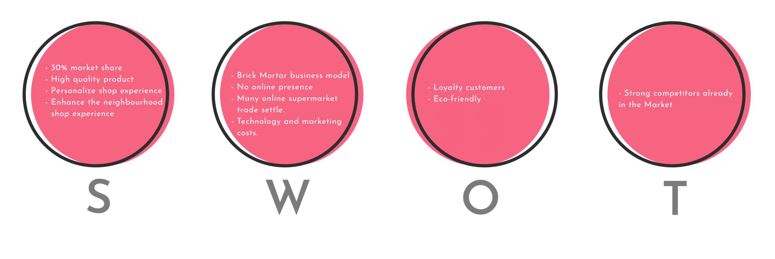
After an in-depth SWOT analysis of our client, ABC Groceries, we identified users who were already ABC’s customers, those who were not, users of online shops and users who were still reluctant to this type of online purchasing platforms.
User Survey & Interviews
We’ve send out an online survey to collect quantitative data on user shopping behaviours, engagement with the brand and their awareness of the online store. We collected 20 responses from users aged between 17–30 years old.
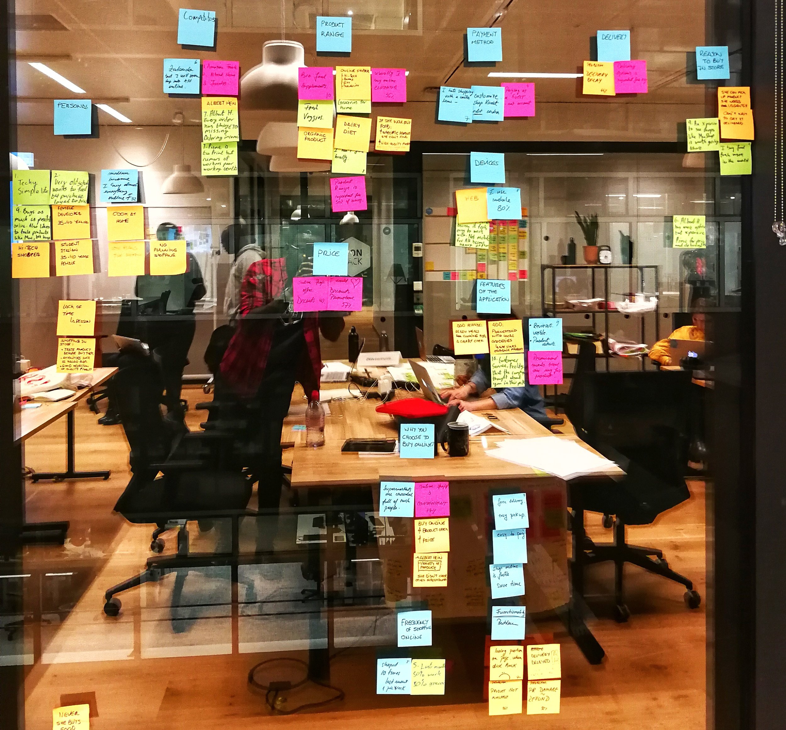
Discovering trends through Affinity Mapping
We synthesised our findings with affinity mapping to discover the trends from our user research. The comments from our users are written on sticky notes and grouped together on the window.
We then went through all the data. We decided to take 5 minutes to start getting keywords, quotes and ideas from all the information and did an affinity map.
Problem Statement
Say hello to Ama.
Ama loves to eat seasonal and fresh produce, but often doesn’t have enough time to do groceries due to her busy work schedule. She shops mostly on weekends and finds it tiresome to stop by a grocery store after work.
User Journey
She normally experiences frustration when looking for the products she needs online and her groceries are always late when delivered. On the days she goes to the supermarket, she gets into a long waiting queue before she pays. So how could we help Ama?
Pain Points
With the Moscow method we prioritized them in groups for a “must have”, “should have”, “could have” and “won’t have”. We found a way to add value for our customers, by offering a healthy recipe package. The recipe package will have all ingredients based on a customer’s diet, together in a box and ready for preparation. Also, we added a Virtual Shopping Assistant feature, to help recommend meals and products tailored to our user’s preferences.
This means they can still eat healthy, enjoy cooking and keep their fitness or diet goals.
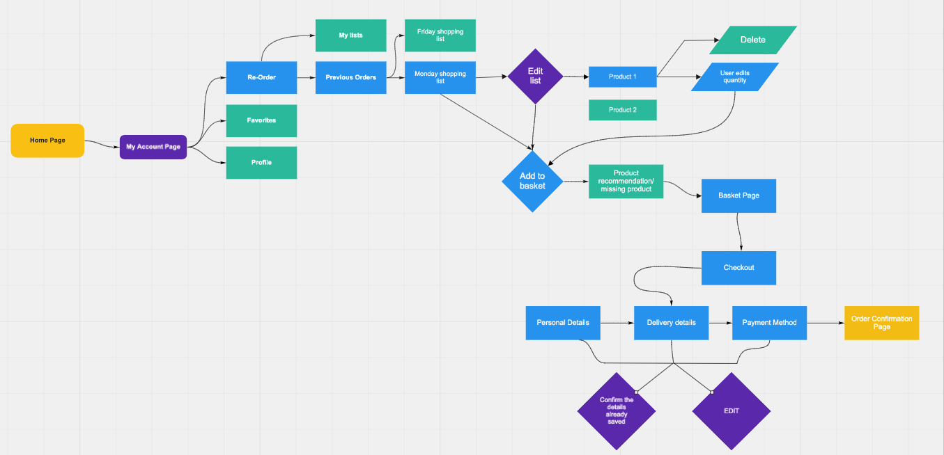
User Flows & Sitemap
After creating the sitemap and figuring out our user flows, we were ready to wireframe and prototype. We made Low fidelity wireframes in sketch after our paper prototype. It took us several iterations before the prototype was ready for actual user testing.
Paper Prototype
Mid-fidelity Prototype
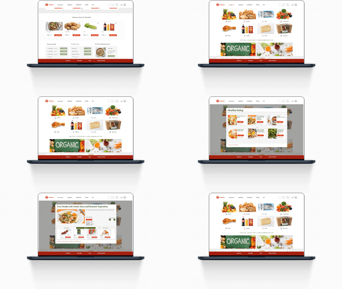
After making changes and retesting our paper prototype, we created Mid-fidelity wireframing in Sketch.
Groceries Shopping for the Digital Age
Minimalistic User Experience
Get Inspired with Recommended Recipes
On-boarding with Ease
Feedback & Next steps…
After sharing with our clients our research, solution and design, we received great feedback. Mainly about our MVP of creating a Virtual Shopping assistant. We still had to make that stand-out and showcase more of what we are offering.


